During the past few semesters, I've been working with Prof. Slobodan Vucetic on a graduate level research project. I was originally introduced to him through Jon Ikoniak while I was looking for work. After talking to Prof. Slobodan for about a semester, he presented me with a few projects that had either gone dormant or could use some sort of help. Some of these projects were about algorithm optimization on micro devices and various types of machine learning. One of the last ones that he brought up was a project that aimed to be able to predict traffic patterns and travel time.
Sounds Like Fun
So, why did the traffic project catch my eye? For a few reasons. The first is that it seemed to be within my field. I felt that I could pick up GIS tools and start playing with them pretty quickly. Some of the tools themselves sounded like fun -- I have never really used PostgreSQL, let alone the PostGIS plug-in, before. The prospect of being able to turn my results into a web application was also pretty exciting. What better way to show off your work then by letting people us it on-line?
A Little More Project Background
The city of Minneapolis has a couple of thousand of sensors strewn across its highway system. These sensors report data once every ten minutes, 24 hours a day, 7 days a week. Prof. Slobodan had managed to get a few years worth of this data. The end goal was to use this historical data to predict future patterns. A PhD student had worked on the project for some time, but was missing some key data structures. It turns out that knowing how sensors are related makes a pretty large difference when trying to make a prediction. For whatever reason, this type of structure was never created.
That's where I was to initially come in. My job was to create a graph that described how sensors were related. We needed to know which sensors fed into which other sensors. Before actually starting on this project, Prof. Slobodan handed me a book on GIS systems and asked me to read it. After doing so, I felt pretty confident that GIS systems were the answer to this portion of the project. From there, I was off and running!
Method
Before I get into "the how," I should probably give a list of tools that I used:
- PostgreSQL with PostGIS extension -- These two tools allowed me to create databases that had geometry columns. This allowed me to store and query for parts of maps with SQL.
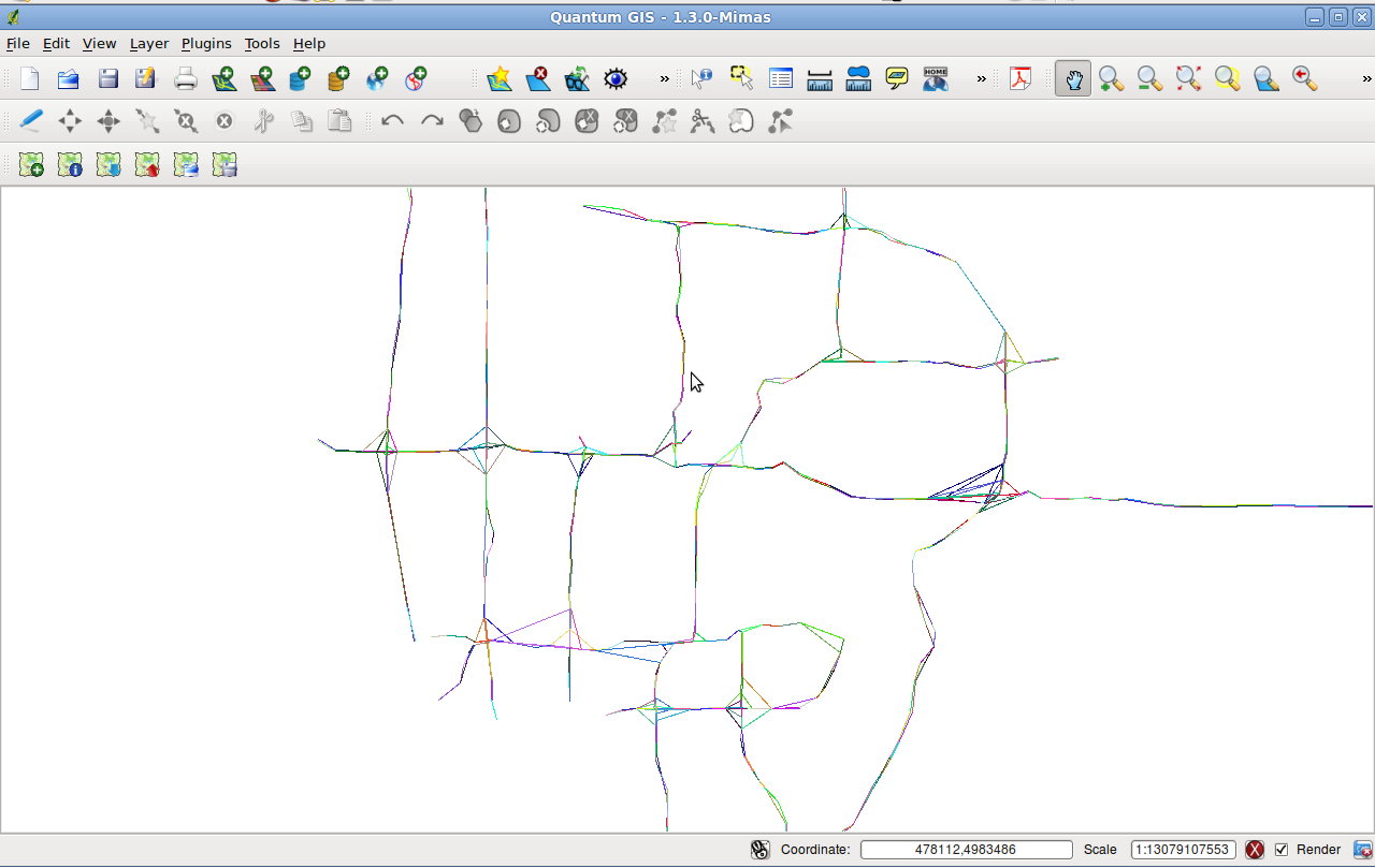
- QGIS -- I used this tool to view the GIS data that I had stored inside of Postgres. It even allows me to do queries and to style my geometries based on the other data in that geometry's row. Pretty neat!
- PHP -- I used PHP to tie things together. Most of my work dealt with the database, so PHP was used mostly as a query container. It was also used in another part of the project to deliver geometry data to the web client via an AJAX call.
- OpenStreetMap -- The data that came from the MNDOT wasn't very good -- the metadata wasn't good enough for me to discriminate between highways and side streets. OpenStreetMaps has an awesome amount of data attached to each geometry, making it easy for me to filter my queries based on what type (highway, residential, ramp) of road I was trying to view.
- OpenLayers -- This package allowed me to display GIS data in a Google Maps type of manor. Life saver!
So, here's what I was given by Prof. Vucetic:
- Some "raw" (they were really pre-processed) sensor readings (for later use)
- A CSV file containing the coordinates of each sensor
In order to figure out how each sensor was related to each other, I had to figure out how they were related to the roads. I had to figure out which sensor belonged to which road segment. I did this by using a few clever geospatial queries. In short, I associated each sensor with the highway that it was closest to. This let do a problem though: sometimes multiple sensors were associated to the same logical road segment. In order to get around this, I used a clever geospatial query to redraw the map so that no road segment was over 0.5 miles in length. This was short enough to allow each station to be associated to its own segment. From here, I "reduced" the road graph -- I removed the segments that did not have sensors attached to them. What I was left with was a graph that contained only road segments that were attached to sensors. I now had a sensor graph.
From here, we did some editing by hand. The map had some built-in errors that caused some pretty weird behaviors. The "match the sensor to the closest road segment" method wasn't fool-proof, either. It worked great until there were intersections or places where highways intertwined. Some manual editing and sanity checking in QGIS got us the rest of the way there. I guess I should note that we didn't check every single segment -- errors in the graph still exist.
The next part was up to Vladimir and Prof. Vucetic. They used some sort of linear regression algorithm to analyze the historical data and to come up with some alpha and beta values for an equation to generate a predicted travel speed for a given sensor at a given time. This list of alphas and betas was then handed over to me. This is where the web application starts.
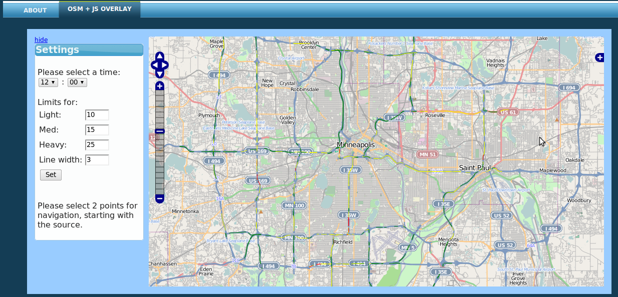
In order to really show the usefulness of our work, we decided to create a web app that would offer the user a route based on travel time. In order to reduce the amount of time spent on the interface, I force the user to select a sensor instead of allowing them to pick random points or to use addresses. When a user selects two points, they can either opt to get a shortest distance or a shortest travel time route. Both are achieved by using a simple Dykstra algorithm. In the case of the shortest distance query, I simply use each road segment's length as the weight (these values are pregenerated to save time). In the case of the travel time query, I have to calculate the travel time for each segment. I query for the distance, alpha, beta, and historical speed for this segment at the chosen point in time. A * historical speed + B gives the predicted speed, which is used with the segment length to predict the travel time.
This was slow. There are several thousand edges in the road graph. In order to solve this performance problem, I sought to reduce the graph size. I decided that the best way to do this was to precache links between sensors. Given two adjacent sensors, I can query for the path (the road segments) between the two (as well as the overall length, etc). I opted to find the shortest distance between each sensor for a couple of reasons. For one, the station graph is much smaller than the road graph. Secondly, if I know a predicted travel speed, it does not make sense to take a longer drive between two sensors -- I may avoid certain sensors, but I'll always take the shortest path between sensors, which yields the shortest driving time. This reduction in graph size allows for sub-second route generation in our model. As a point of comparison, the old method took minutes.
Now that I was able to generate routes, I had to display them. OpenLayers was a life-saver. It did almost everything I needed out-of-the-box. I was able to display all of the sensors over a map of Minneapolis that was provided my OpenStreetMap. Allowing a user to select two sensors was pretty easy, but displaying an arbitrary line was not. In order to get around this, I wrote a small PHP script. This script would figure out the route (which road segments and in which order they were to be traveled) and would query the database for the geometries in WKT (Well Known Text) format. This was then sent to the web browser and rendered by OpenLayers. I was not able to display my routes in a web browser! Pretty cool.
Afterthoughts
There are several things that I'd like to fix. For one, I'd love to find a better way for the user to select their source and destinations -- the current interface is a bit fussy and busy. The second thing would be to add the ability to do U-turns. Currently, the software doesn't acknowledge the ability to exit and reenter the highway -- it ignores all side roads. U-turns would make it much easier to find examples of places that our software would avoid traffic. Thirdly, it'd be nice to compare the shortest distance route to the shortest time route. It'd be useful to display something along the lines of, "Shortest distance travel time: 20 min, Shortest possible travel time: 10 min."
There were some technical aspects of the project that I would have changed as well. I don't think that I did a good job of documenting each of my datasets or of tracking my source code changes. I think that I should have also implemented some of my solutions as SQL stored procedures instead of PHP scripts. It would have also been nice to have a little framework for running experiments -- perhaps something that could run a series of scripts and label the resulting datasets so that I could examine them later. I don't know -- I just felt a little overwhelmed with tables.
I think the project was a great success. We can now make predictions and immediately put them to use. I also wrote my software in such a way that I can do the same GIS operations on other datasets and produce the graphs needed to do predictions. Despite my user interface being a bit fussy, the application looks nice and behaves most of the time.
Eye Candy
Here are some screenshots of the different tools and pieces of software during use.
Future Of Computing 2010 Poster (ppt)
Future Of Computing 2010 Poster (pdf)